AtomWords
DictionarycommunitySubjects
StyleSTechniqueTMotionM
Sign inSign up

Color

SubjectsStyle·Technique·Motion
AtomWordsThe Visual Dictionary of AI Art Keywords

Explore

  • AI Style Prompts
  • AI Technique Prompts
  • AI Motion Prompts
  • Prompt Subjects
  • AI Keywords Dictionary
  • Free Video Prompts
  • Explore +

AtomWords

  • About
  • Updates

Legal

  • Privacy Policy
  • Terms of Service
  • License

Contact

  • hi@atomwords.com

© — AtomWords

AllAestheticMediumMaterialColorMood
abcdefghijklmnopqrstuvwxyz

Word count

Any
Any1234
damp cedar palette
Color

damp cedar palette

Add to Favorites
powder blue palette
Color

powder blue palette

Add to Favorites
navy and cream
Color

navy and cream

Add to Favorites
flat contrast colorway
Color

flat contrast colorway

Add to Favorites
sun-bleached palette
Color

sun-bleached palette

Add to Favorites
pale amber tone
Color

pale amber tone

Add to Favorites
signal yellow palette
Color

signal yellow palette

Add to Favorites
cornflower blue palette
Color

cornflower blue palette

Add to Favorites
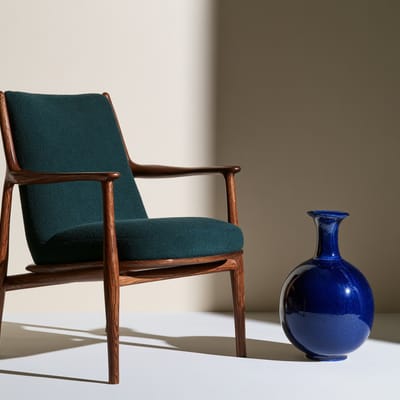
pine and cobalt
Color

pine and cobalt

Add to Favorites
High-velocity motion blur
Color

High-velocity motion blur

Add to Favorites
Anaglyph color separation
Color

Anaglyph color separation

Add to Favorites
greige palette
Color

greige palette

Add to Favorites
canary and cobalt
Color

canary and cobalt

Add to Favorites
Low-chroma palette
Color

Low-chroma palette

Add to Favorites
Muted moss palette
Color

Muted moss palette

Add to Favorites
Magenta green split
Color

Magenta green split

Add to Favorites
sage and birch
Color

sage and birch

Add to Favorites
birch and ultramarine
Color

birch and ultramarine

Add to Favorites
Hyper-saturated floral backdrop
Color

Hyper-saturated floral backdrop

Add to Favorites
Amber and slate palette
Color

Amber and slate palette

Add to Favorites
lingonberry red palette
Color

lingonberry red palette

Add to Favorites
monochrome yellow
Color

monochrome yellow

Add to Favorites
nordic graphic palette
Color

nordic graphic palette

Add to Favorites
Rough blurry monochrome
Color

Rough blurry monochrome

Add to Favorites
  • Page 1
  • Page 2
  • Page 3
  • Page 9
  • Next page

Color keywords for AI image prompts101

Color palette and tonal control — pastel, monochrome, iridescent, neon, muted.

  1. polaroid—Polaroid is a distinctive instant-print photographic look defined by a square composition, soft focus, muted, slightly warm colors, and a signature white border.
  2. Autumnal palette—Autumnal palette — a warm, earthy color scheme of burnt orange, deep red, golden yellow, and brown, inspired by fall foliage and typically avoiding cool tones like blue or green.
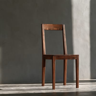
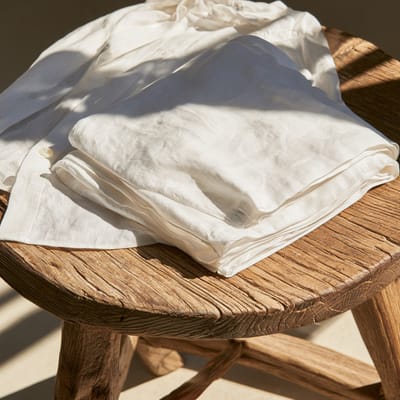
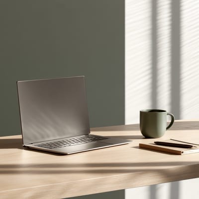
  3. damp cedar palette—Damp cedar palette is a color scheme of deep, saturated timber browns, muted moss greens, and slate grays that evoke wet wood in a quiet forest.
  • subdued earth tones—Opt for subdued earth tones to establish a grounded, premium atmosphere inside a modern office lounge, avoiding the clinical feel of pure white and grey.
  • analogous color scheme—A palette built from colors adjacent on the wheel, creating seamless, low-contrast harmony and a serene visual flow.
  • honey blonde—A warm, rich golden-yellow hue with amber undertones that radiates soft, sun-kissed warmth and approachable luxury.
  • Impressionist palette—Impressionist palette — a color scheme of soft, luminous hues often paired as complements (e.g., lavender & yellow, coral & teal), applied in visible brushstrokes to create a vibrant, airy feel.
  • warm neutral palette—Employs skin-anchored, earthy tones—sand, terracotta, and warm wood—with low saturation to evoke an atmosphere of quiet luxury and premium stability.
  • black and white—The absence of hue, using only black, white, and grayscale tones to emphasize form, texture, and contrast.
  • navy and brass—A timeless, high-contrast color palette combining deep, authoritative dark blue with warm, metallic gold-toned accents to project trust and heritage.
  • nordic graphic palette—Nordic graphic palette is a clean color system of pale wood, off-white, soft mustard, and muted blue, creating balanced contrast through flat graphic blocks.
  • Rough blurry monochrome—Rough blurry monochrome — a gritty black-and-white style marked by heavy grain, out-of-focus motion, and stark contrast that creates a raw visual urgency.
  • imperial yellow—Imperial yellow is a brilliant, high-saturation golden hue historically reserved for Chinese royalty, evoking immense warmth, power, and sacred dignity.
  • Charcoal grey—Charcoal grey is a deep, smoky shade of near-black with cool, earthy undertones, offering a softer and more organic alternative to pure, stark black.
  • platinum blonde—A striking, high-fashion shade of ultra-pale, metallic white-blonde that brings an icy, minimalist elegance to hair, textiles, and modern designs.
  • Desaturated coastal palette—Desaturated coastal palette is a soft color scheme featuring washed-out sandy beiges, muted driftwood grays, and pale seafoams that mimic a quiet, overcast beach.
  • wisteria purple—Wisteria purple is a soft, muted violet with cool undertones, resembling the delicate blossoms of Chinese wisteria draped over classical garden walls.
  • complementary color harmony—A classic color relationship utilizing exact opposites on the color wheel to create maximum visual vibration, balance, and impact.
  • Muted moss palette—Muted moss palette — a subtle color scheme dominated by desaturated sage, deep forest greens, and earthy grey tones, creating a calm, organic visual feel.
  • teal and orange—Teal and orange is a high-contrast color grade where warm, glowing orange tones dominate highlights and skin, while cool cyan-teal sinks into the shadows—creating a vivid, cinematic push-pull that makes every frame pop.
  • Hyper-saturated floral backdrop—Hyper-saturated floral backdrop is a set design choice featuring intensely vivid wall-to-wall flowers that blast the background with pure, eye-popping color.
  • scandinavian high-contrast—Incorporate a scandinavian high-contrast palette into a Scandinavian bedroom to deliver crisp tranquility using stark whites, soft grays, and deep charcoal.
  • Alabaster backdrop—Alabaster backdrop — a smooth, semi-translucent off-white background that mimics the fine-grained texture of carved stone, diffusing light with a soft, milky glow.
  • tetradic color scheme—A rich, dynamic harmony using four colors arranged in two complementary pairs, offering maximum color variety and vibrant contrast.
  • Spring palette—Spring palette — a soft, pastel-heavy color scheme of fresh greens, pale pinks, and warm yellows, evoking a garden in early bloom.
  • jewel tones—Deep, rich, saturated colors reminiscent of gemstones—ruby, amethyst, emerald, sapphire—that evoke luxury and opulence.
  • Zorn palette—Zorn palette — a restricted four-color painting scheme using only ivory black, yellow ochre, vermilion, and white, creating a warm, earthy range from deep shadow to bright highlight.
  • chartreuse—A striking, acidic blend of yellow and green that delivers high-energy visual punch and modern edge.
  • oatmeal color—Utilize an oatmeal color scheme to envelop a cozy reading nook in a soothing, tactile warmth that feels infinitely softer and richer than flat white.
  • millefleurs palette—Millefleurs palette — a color scheme drawn from medieval tapestries, featuring a dense scatter of tiny flowers and leaves in vivid hues set against a dark, nearly black background, creating a rich, layered, and deeply ornamental look.
  • safety orange—A high-visibility, intensely saturated neon-adjacent orange used for industrial utility, instantly conveying a sense of urgency, hazard, and bold modernism.
  • Scandi palette—Cool, muted palette of pale woods, icy blues, and off-white tones, evoking Nordic minimalism and serene natural light.
  • persimmon orange—Persimmon orange is a warm, saturated reddish-orange hue inspired by ripe autumn fruit, bringing a festive yet grounded earthiness to traditional Chinese art.
  • muted color palette—A low-saturation color harmony that softens contrast, creating a sophisticated, peaceful, and understated atmospheric look.
  • Bone white—Bone white is a warm, chalky off-white with subtle ivory and gray undertones, mimicking the raw, matte texture of natural unpolished bone or dry clay.
  • referee yellow card—A referee yellow card held high against a blurred stadium backdrop brings instant dramatic tension and a vivid pop of cautionary color to sports imagery.
  • duotone—A high-impact graphic effect restricting the image to two contrasting colors, popular in bold prints and retro-modern designs.
  • redscale—Redscale is a photographic technique where color negative film is exposed in reverse, yielding a warm, reddish-orange toned image with deep red shadows and orange highlights.
  • madder red—Madder red is a warm, earthy crimson color derived from natural plant roots, offering a muted and deeply historical tone that feels both organic and regal.
  • Oceanic palette—Oceanic palette is a cool-toned color scheme built from deep blues, teal greens, and pale aquamarines — the hues of open water, often accented with white or soft gray for contrast.
  • expired film—Expired film is a look where chemical degradation shifts colors unpredictably: blacks fade to brown, whites warm up, and shadows lean teal or magenta, all layered with heavy grain for a nostalgic, analog feel.
  • birch and ultramarine—Birch and ultramarine is a two-color palette pairing pale, warm blonde wood tones with intense, deep lapis blue for a crisp, Scandinavian-inspired contrast.
  • Magenta green split—Magenta green split is a vivid two-tone color palette that pits intense magenta pink against deep emerald green across highlights and shadows.
  • neon colors—Electric, glowing hues that mimic the intense light of neon signs, adding a vibrant, urban edge and piercing quality.
  • warm colors—Reds, oranges, and yellows that advance visually, evoking heat, energy, and a sense of intimate coziness.
  • triadic color scheme—Three hues spaced evenly on the color wheel yield a vibrant yet balanced, visually dynamic and energetic palette.
  • azurite blue—Azurite blue is a deep, saturated mineral blue with a cool, crystalline intensity, historically used in traditional Chinese landscape paintings to depict majestic peaks.
  • duotone colorway—Unify a bold background using a duotone colorway on an abstract vinyl record shape to evoke the modern, high-impact aesthetic of global music streaming covers.
  • pastel colors - macaron—Soft, desaturated tints that evoke sweetness, modernity, and an airy, light-filled delicacy.
  • celadon glaze—Celadon glaze is a classic ceramic finish prized for its pale green, jade-like hue, subtle translucency, and delicate network of fine crackles across the surface.
  • cinnabar lacquer—cinnabar lacquer is a traditional Chinese finish of deep, opaque vermilion-red, often carved into rich relief patterns with a soft, lustrous semi-matte sheen.
  • split-complementary—Split-complementary uses one base hue plus the two colors adjacent to its opposite, creating vivid contrast that’s softer and more nuanced than a straight complementary pair.
  • camouflage palette—Camouflage palette is a color scheme of organic, earthy tones like olive drab, warm tan, and charcoal brown that mimics the natural colors of forest and soil.
  • monochromatic color scheme—A cohesive palette restricted to a single base hue, utilizing variations in lightness, saturation, and tone to define form and depth.
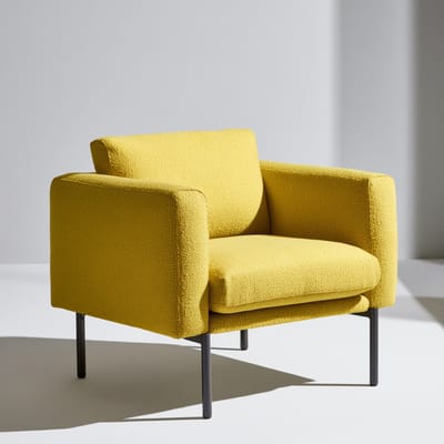
  • signal yellow palette—Signal yellow palette — an intense visual scheme dominated by vivid, high-visibility canary yellow, grounded by muted neutral grey and white for maximum contrast.
  • High-key white palette—High-key white palette is a bright, airy style where the image is deliberately overexposed to reduce contrast, resulting in a scene dominated by whites and light tones with minimal shadows.
  • yellow ochre—A warm, clay-like golden yellow that channels raw earthiness, rustic antiquity, and natural warmth, ideal for creating comforting, historical atmospheres.
  • Desert palette—Desert palette is a warm earthy color scheme inspired by arid landscapes, featuring shades of terracotta, sand, ochre, and muted sage, creating a sun-baked, harmonious look.
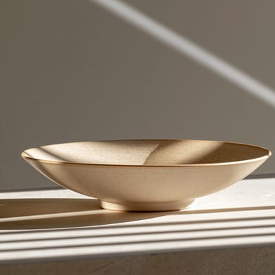
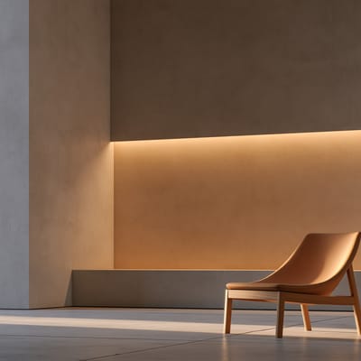
  • pale amber tone—Pale amber tone is a warm visual palette characterized by soft golden-yellow and light honey hues, giving images a gentle, nostalgic daylight glow.
  • split toning—Split toning is a color grading technique where you apply one hue to the highlights and a different, often complementary, hue to the shadows, creating a dual-color wash across the image.
  • coral color—A warm pink-orange hybrid that radiates tropical energy — vivid yet soft, bridging citrus zest and blush romance.
  • matte black accents—Introduce matte black accents into a light-filled bedroom to ground the pale, airy Nordic color palette with sharp, sophisticated graphic punctuation.
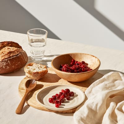
  • lingonberry red palette—Lingonberry red palette is a Scandinavian color scheme centered on a deep, tart berry red balanced by soft oat cream, pale birch wood, and quiet grey.
  • flat contrast colorway—Flat contrast colorway — a color palette technique using bold, distinct solid hues with uniform brightness and minimal shading, creating a graphic poster look.
  • primary color palette—A bold color scheme using pure red, yellow, and blue, creating a vibrant, graphic, and starkly modern visual impact.
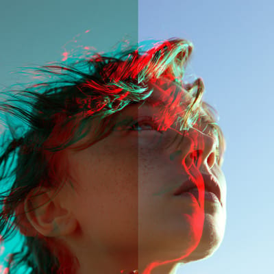
  • Anaglyph color separation—Anaglyph color separation is a classic 3D technique where red and cyan channels are physically shifted, creating iconic two-tone color fringes along every edge.
  • pine and cobalt—Pine and cobalt is a dual-hue palette pairing deep evergreen forest tones with intense cobalt blue to create a cool, grounded Scandinavian contrast.
  • complementary color scheme—A complementary color scheme uses two hues from opposite sides of the color wheel to create maximum contrast, making both colors appear more vibrant.
  • cadmium red—A fiery, highly opaque warm red that commands instant attention with its intense, slightly yellow-toned saturation, perfect for bold focal points.
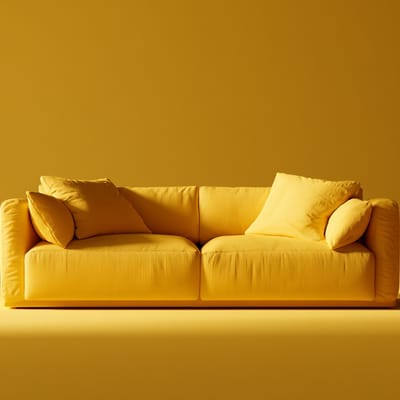
  • monochrome yellow—Monochrome yellow — a strict single-hue palette where every element, shadow, and highlight in the frame is rendered purely in varying shades of yellow.
  • Klein blue Color—A deep, matte, and mesmerizingly saturated ultramarine blue that absorbs light to create a powerful sense of infinite depth, ideal for minimalist designs.
  • oxblood color—A dark, rich red with deep brown and purple undertones, evoking classical luxury, high-end leathercraft, historical interiors, and moody elegance.
  • greige palette—A greige palette is a soft neutral color scheme blending cool grey and warm beige, creating a calm, understated harmony across muted taupe and off-white tones.
  • Fauvist palette—Fauvist palette — an extreme use of brilliant, non-naturalistic colors applied straight from the tube, with bold outlines and simplified forms, ignoring realistic shading or perspective.
  • Desaturated spruce green—Desaturated spruce green is a muted, cool-toned deep green with heavy gray undertones, mimicking the quiet, shadowed foliage of a pine forest on an overcast day.
  • lotus pink—Lotus pink — a delicate, soft traditional Chinese hue evoking fresh, dew-kissed petals, blending a gentle warmth with a serene, translucent undertone.
  • cool colors—Blues, greens, and purples that recede visually, conveying calm, freshness, and a detached, airy atmosphere.
  • Amber and slate palette—Amber and slate palette — a color scheme pairing warm, honey-gold tones with cool, muted blue-grays to create a quiet contrast of cozy heat and sterile calm.
  • pearl white glaze—Pearl white glaze is a traditional ceramic finish featuring a soft, milky-white luster with a subtle iridescent sheen reminiscent of natural pearls.
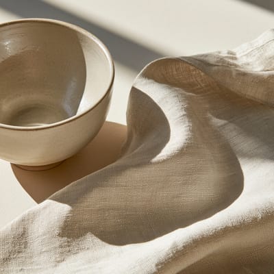
  • sun-bleached palette—Sun-bleached palette — a soft, faded color scheme where vibrant tones look washed out, warm, and softened by prolonged exposure to bright natural sunlight.
  • vibrant colors—High-saturation hues that visually pop and energize any scene, making colors intense and pure without dilution.
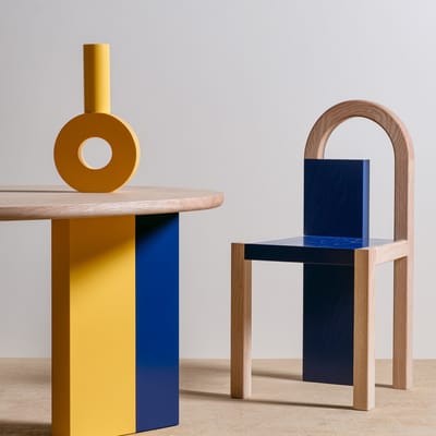
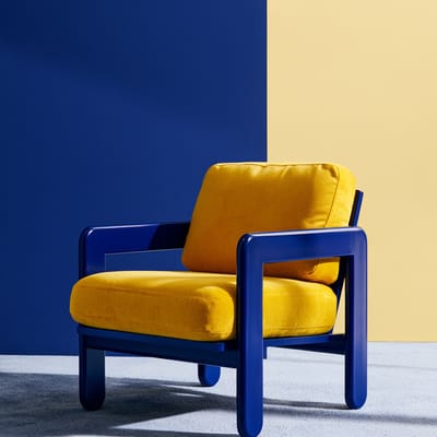
  • canary and cobalt—Canary and cobalt is a high-contrast palette pairing energetic bright yellow with deep saturated blue, creating a bold and clean graphic visual tension.
  • millennial pink—A muted, dusty, and sophisticated blush pink that removes the saccharine sweetness from traditional pinks.
  • verdigris color—A rich, powdery greenish-blue patina formed by the weathering of copper, brass, or bronze, evoking ancient history, weathered luxury, and organic decay.
  • celadon—A pale, misty grayish-green color inspired by traditional jade-like ceramic glazes, evoking serenity, nature, and subtle historical craftsmanship.
  • earth tones—A grounded palette of browns, ochres, olive greens, and warm terracottas inspired by soil, rock, and vegetation.
  • bleach bypass—The bleach bypass process skips chemical bleaching, leaving metallic silver in the film to create high-contrast, muted colors and harsh, deep shadows.
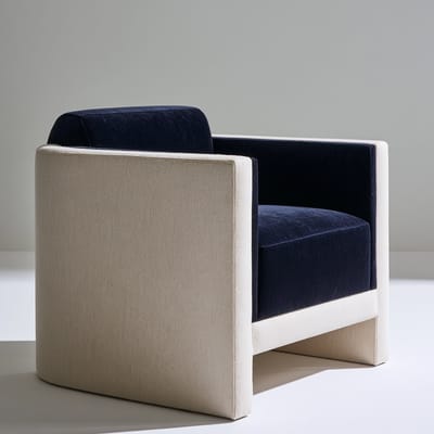
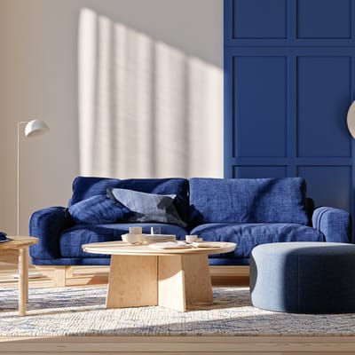
  • navy and cream—Navy and cream is a classic high-contrast color palette pairing deep, dark indigo blue with warm, soft off-white tones for a timeless visual balance.
  • rose gold—A luxurious, warm pinkish-metallic tone blending gold with copper, imparting a soft, modern elegance to products, jewelry, and sleek surfaces.
  • cobalt blue—An intensely vibrant, cool primary blue pigment that creates striking, electric focal points and high-contrast graphic compositions.
  • technicolor saturation—Technicolor saturation is a hyper-vivid color palette where every hue is pushed to near-unreal intensity, mimicking the rich, bold look of classic three-strip Technicolor film prints.
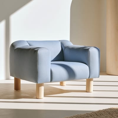
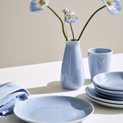
  • powder blue palette—A powder blue palette — a soft, desaturated light blue tone paired with clean neutrals, creating a calm, airy, and gently understated visual balance.
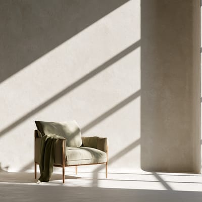
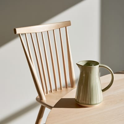
  • sage and birch—Sage and birch — a serene palette pairing muted silvery green with pale blonde wood tones, creating a calm, organic aesthetic with a light Scandinavian touch.
  • indigo—A deep, soul-stirring blue-violet pigment offering organic depth, serene moodiness, and rich, ink-like shadows that bring rustic elegance to any scene.
  • slate color—A moody blue-gray with a stony calm — the color of overcast cliffs, stormwater, and refined minimalism.
  • amber yellow—Amber yellow — a warm, honey-like hue with deep golden-orange undertones that captures the luminous, resinous glow of ancient fossilized pine sap.
  • cornflower blue palette—Cornflower blue palette — a fresh visual scheme dominated by a medium-light blue with subtle violet undertones, creating a serene, airy, and welcoming visual look.
  • Low-chroma palette—Low-chroma palette uses muted, desaturated colors with low saturation, producing a restrained, quiet tone where subtle greys and soft hues dominate the scene.
  • split-complementary color scheme—A base hue paired with the two hues adjacent to its complement provides sharp contrast with softer, more nuanced edges.
  • terracotta color—A warm, earthy, baked-clay reddish-orange that grounds designs with natural, rustic warmth.
  • High-velocity motion blur—High-velocity motion blur is a camera effect where extreme speed smears background elements into streaked lines, giving intense kinetic energy to a moving subject.