1/4
14
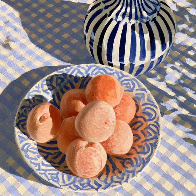
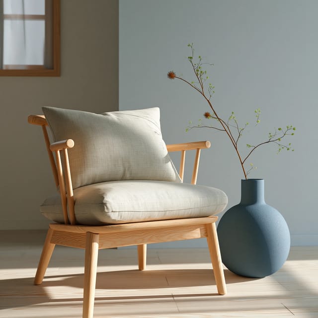
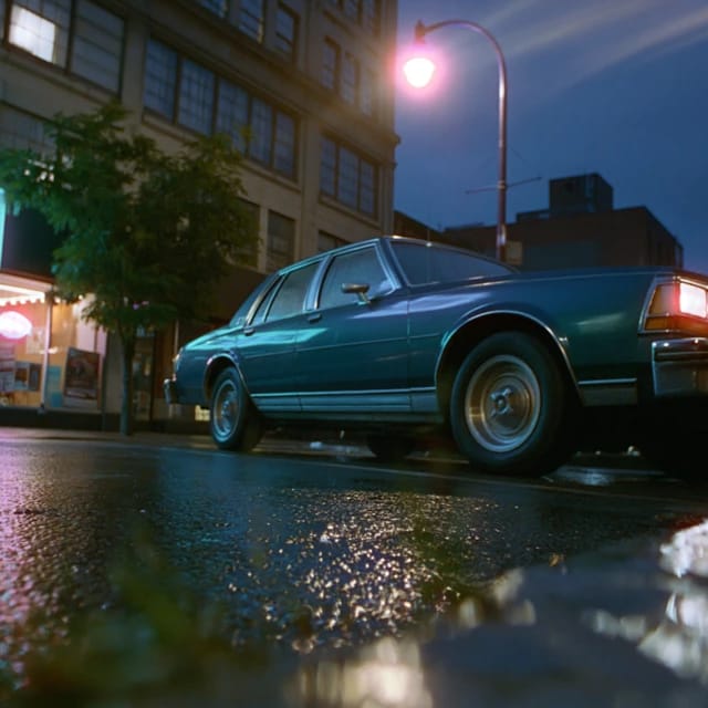
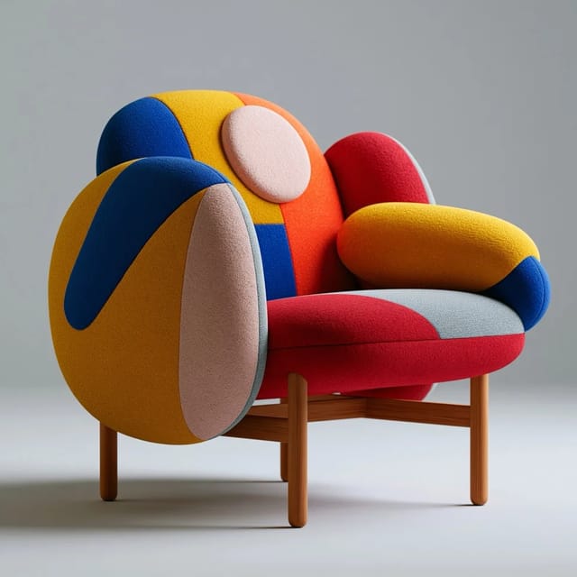
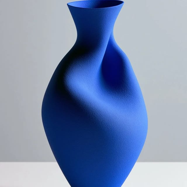
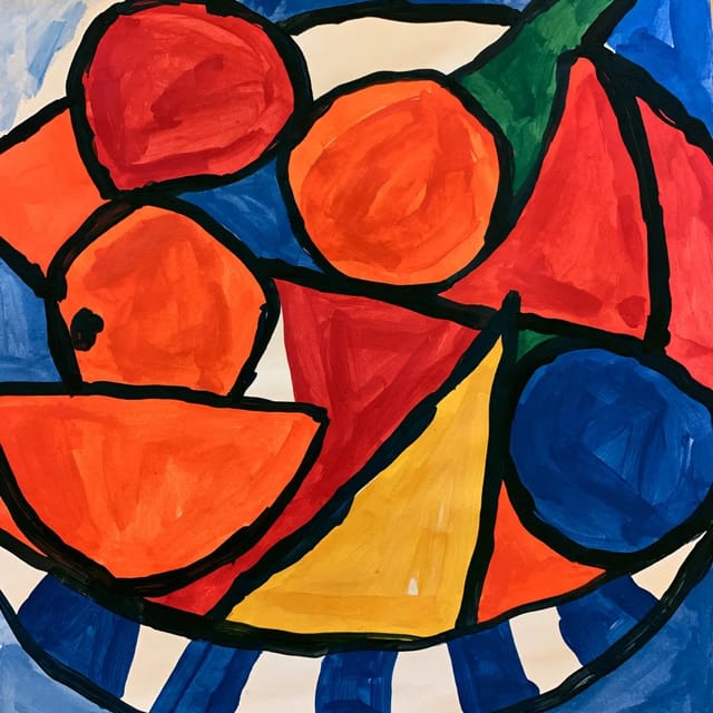
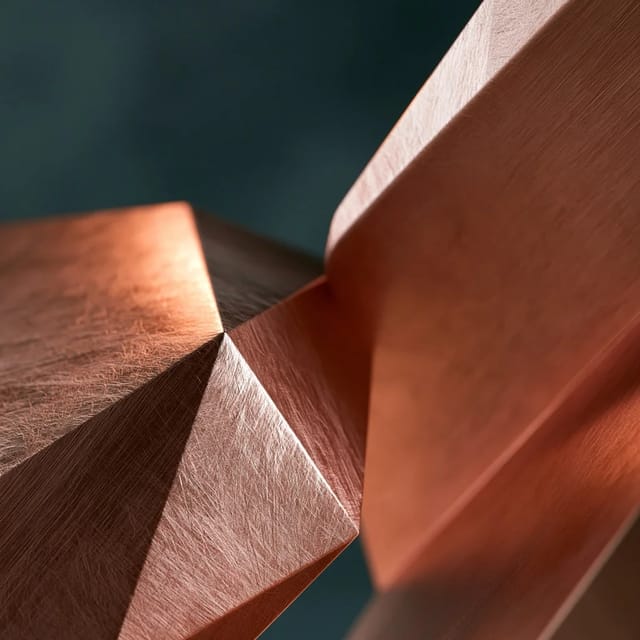
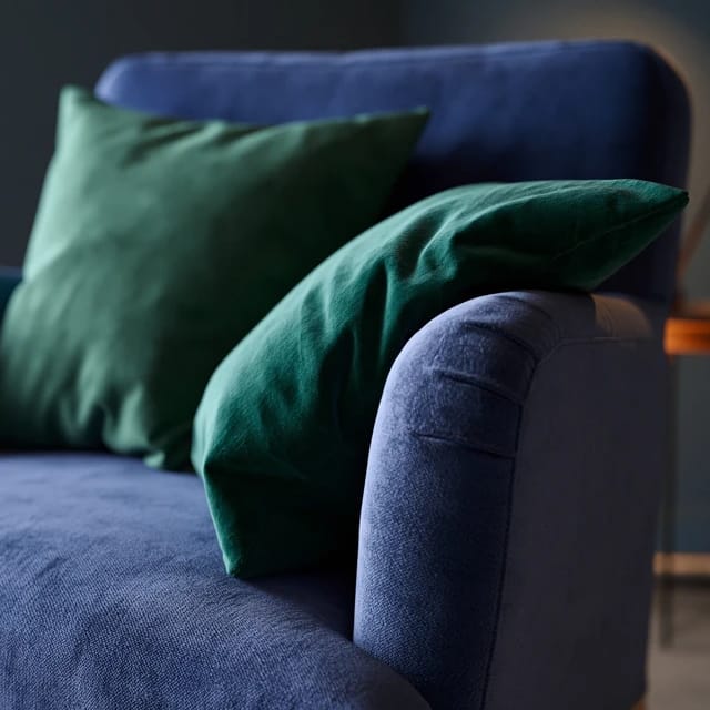
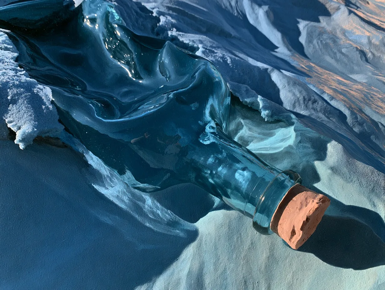
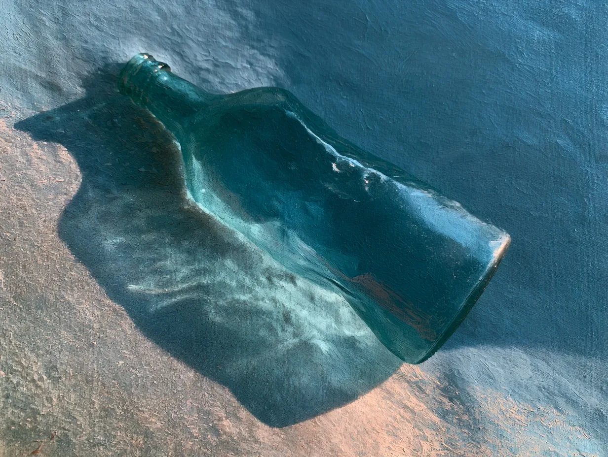
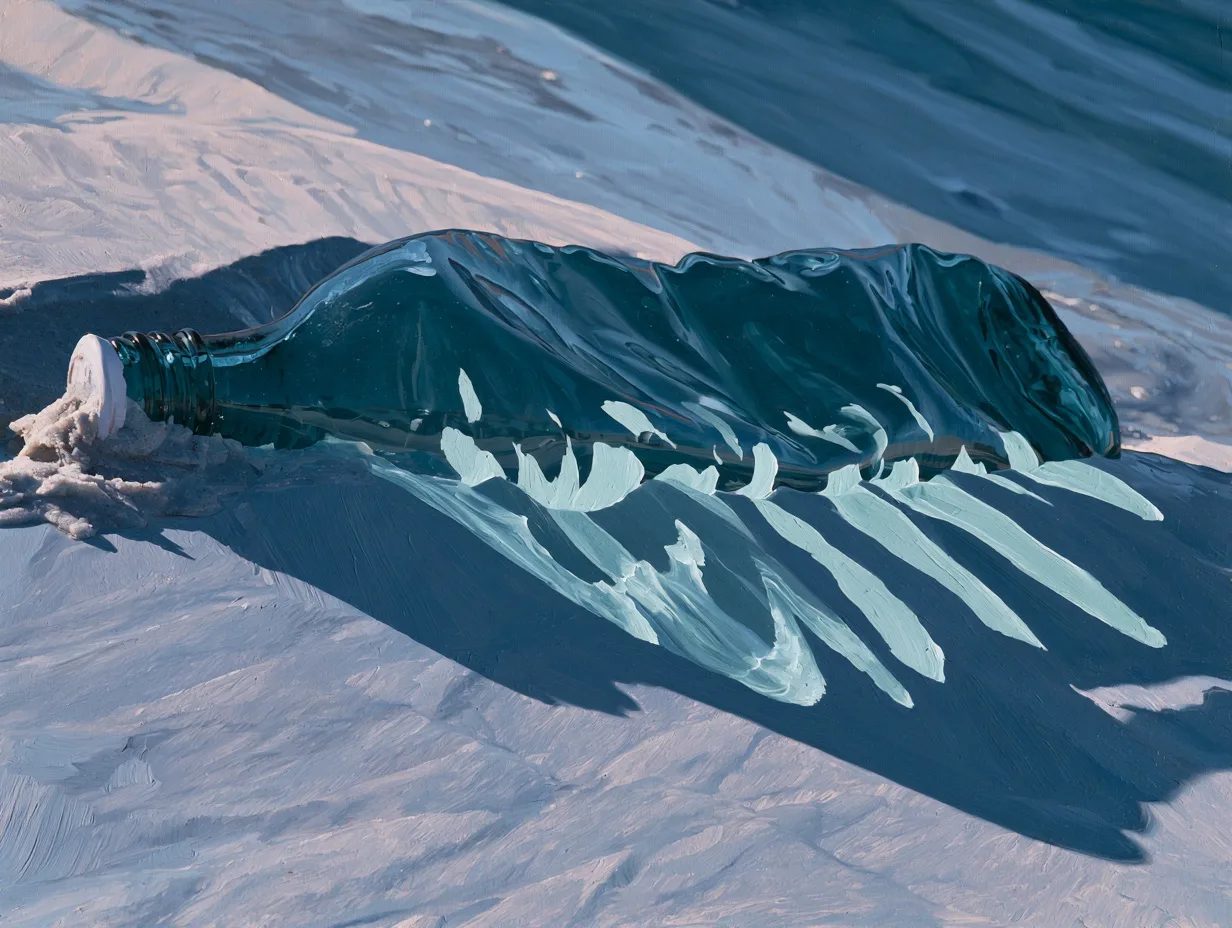
Oceanic palette is a cool-toned color scheme built from deep blues, teal greens, and pale aquamarines — the hues of open water, often accented with white or soft gray for contrast.
Oceanic palette works best for subjects that benefit from a cool, serene mood. Stick to blues, teals, and pale aquamarines—avoid any hint of orange or yellow, which break the marine illusion. The palette is surprisingly flexible: a portrait lit with oceanic tones feels dreamy and detached, while a product shot in the same scheme reads as fresh and clean.
The biggest pitfall is over-doing green. True oceanic palettes lean blue, not forest green. Balance your deepest tone (navy or teal) with a lighter one (aqua or ice blue) and let white or very light gray act as the foam equivalent. If the image starts to feel swampy, you've gone too green.
Full prompt
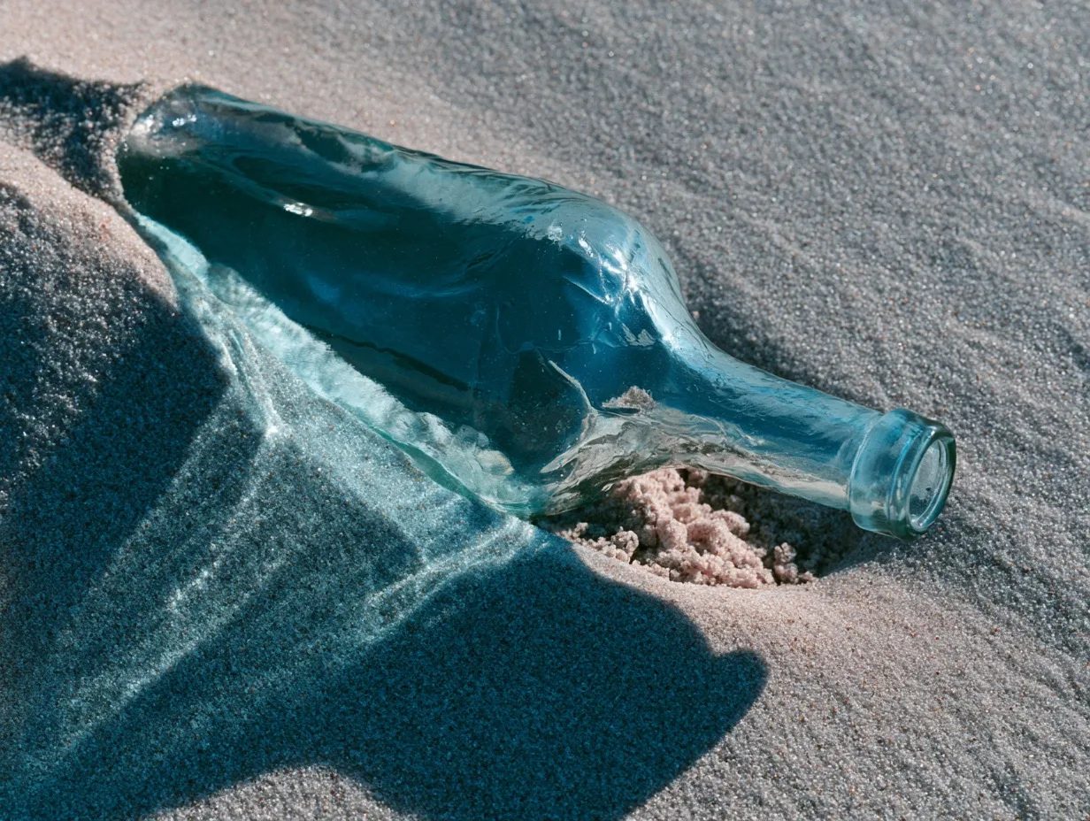
a glass bottle half-buried in wet sand in an Oceanic palette, deep teal and cerulean hues across the glass and shadows, pale aquamarine highlights, cool blue-gray sand --ar 4:3 --style raw --s 100 --preview
Model: Midjourney · v8.2
Made with Oceanic palette
Nothing yet — be the first.