AtomWordsThe Visual Dictionary of AI Art Keywords
AtomWords Insights:
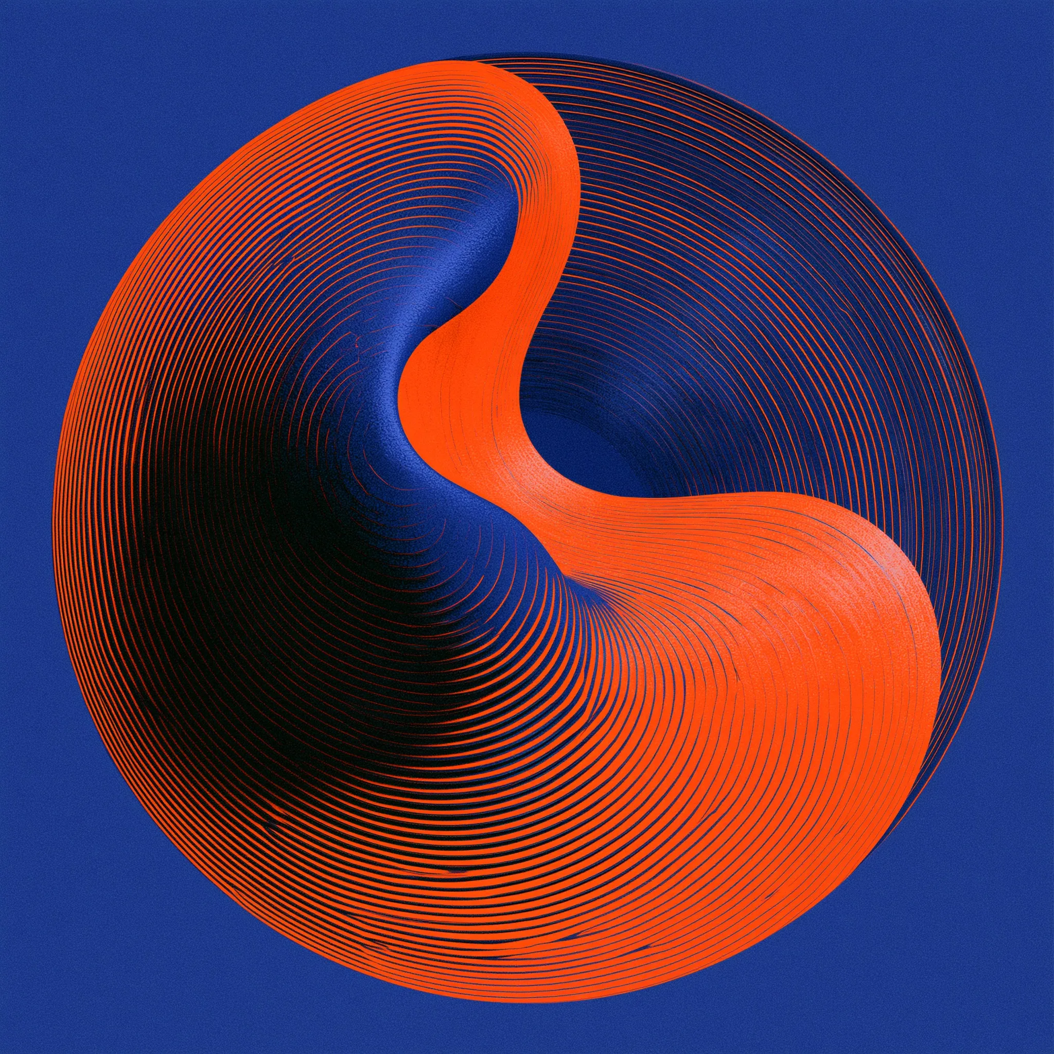
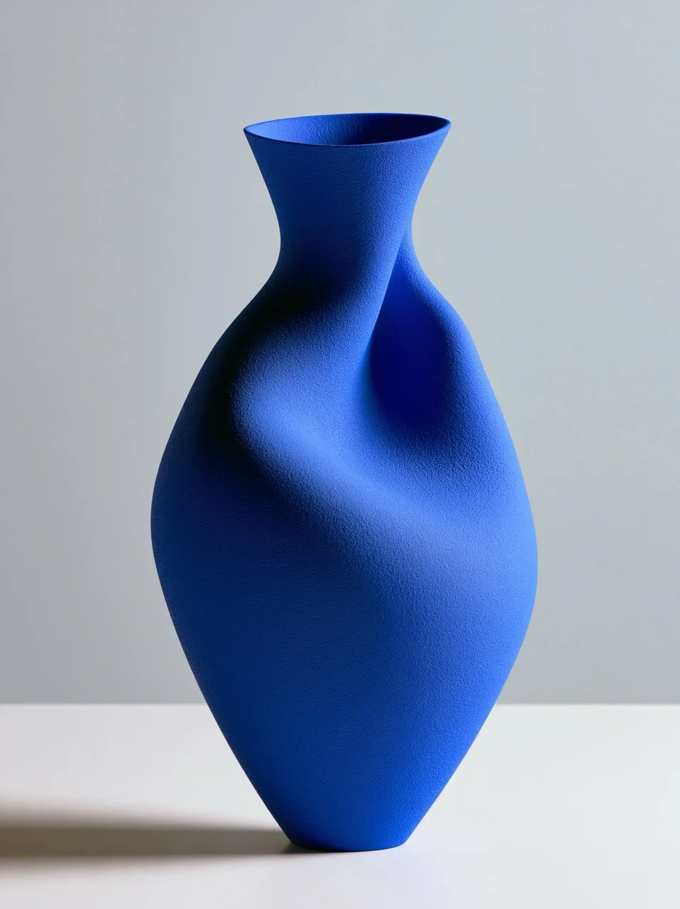
A classic color relationship utilizing exact opposites on the color wheel to create maximum visual vibration, balance, and impact.
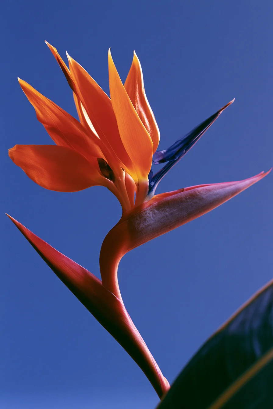
🧠 Complementary Color Harmony
This fundamental color technique pairs hues from opposite sides of the color wheel (such as orange and blue, or yellow and purple) to generate maximum visual vibration and contrast. When placed side-by-side, each color makes the other appear brighter and more intense. The key is balance: using one dominant color and one accent color to prevent visual chaos.
Where to apply: Excellent for graphic design, bold fashion photography, minimalist still lifes, striking architectural facades, and high-impact poster art.
Full Prompts:
complementary color harmony, vibrant orange and deep cobalt blue, a single exotic flower on a textured matte background, soft side-lighting, macro shot, high color contrast, crisp details --ar 4:3 --style raw
Discover More