AtomWords Insights:
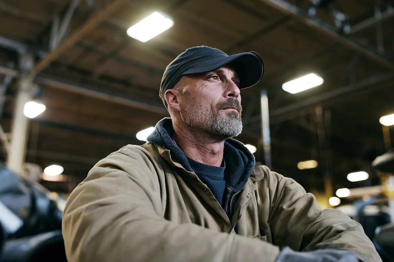
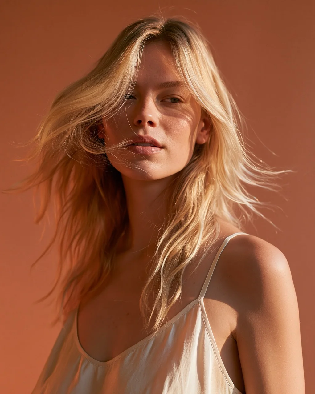
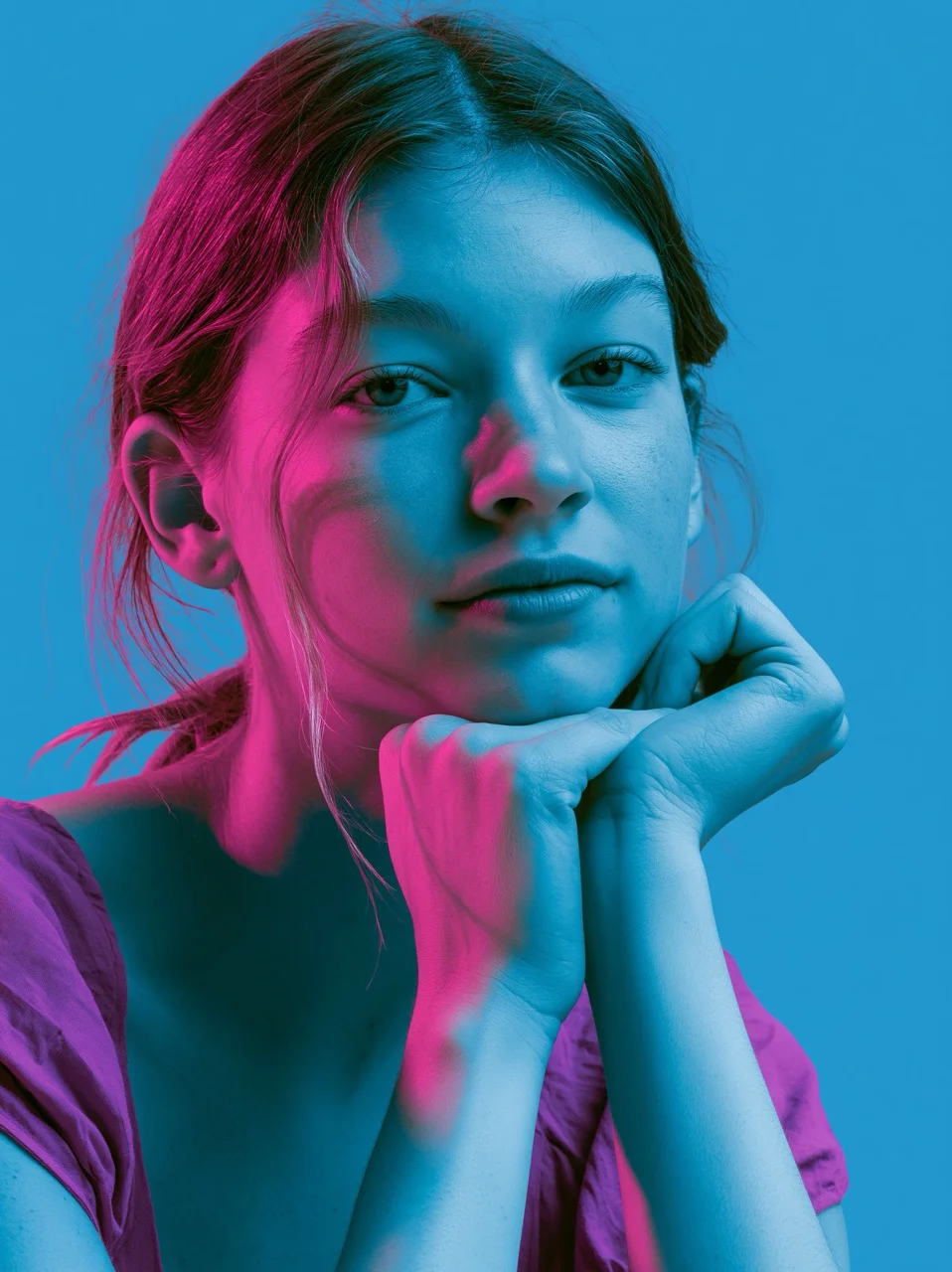
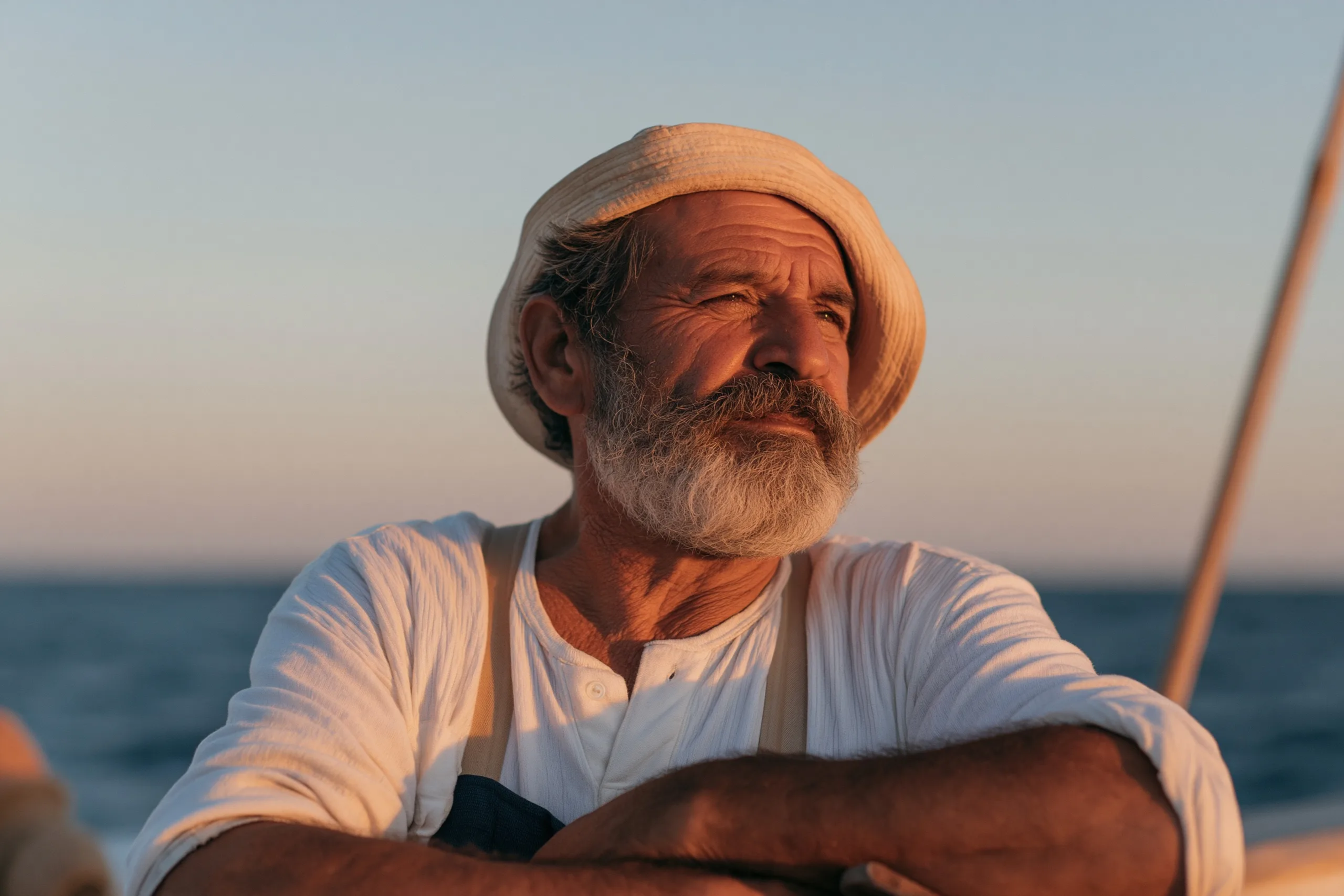
Teal and orange is a high-contrast color grade where warm, glowing orange tones dominate highlights and skin, while cool cyan-teal sinks into the shadows—creating a vivid, cinematic push-pull that makes every frame pop.
When it works (and when it walks away)
Reach for it on any scene with a human face—the orange locks onto skin while teal cools the background, an instant depth trick. Avoid it on lush green landscapes; the grade punches green out of existence, leaving everything sickly.
The pitfall: letting a third hue bleed in. Purple, green, or magenta breaks the two-color tension and muddies the pop. Use a calibration target in your grade—if anything reads as anything but orange or teal, dial it back.
Insider tip: push saturation unevenly. Overcook orange highlights (skin, fire, brass) but keep teal shadows a touch muted—this stops the image from reading as a gimmick and makes it feel like a real film print.
Full Prompts:
teal and orange grade over a dusk portrait of a fisherman on open water, every highlight and skin tone burning orange, every shadow and the whole sea sunk in deep teal, no third hue anywhere in frame --ar 3:2 --style raw --s 50 --no green, purple --preview