muted color palette
Curated by musefeng
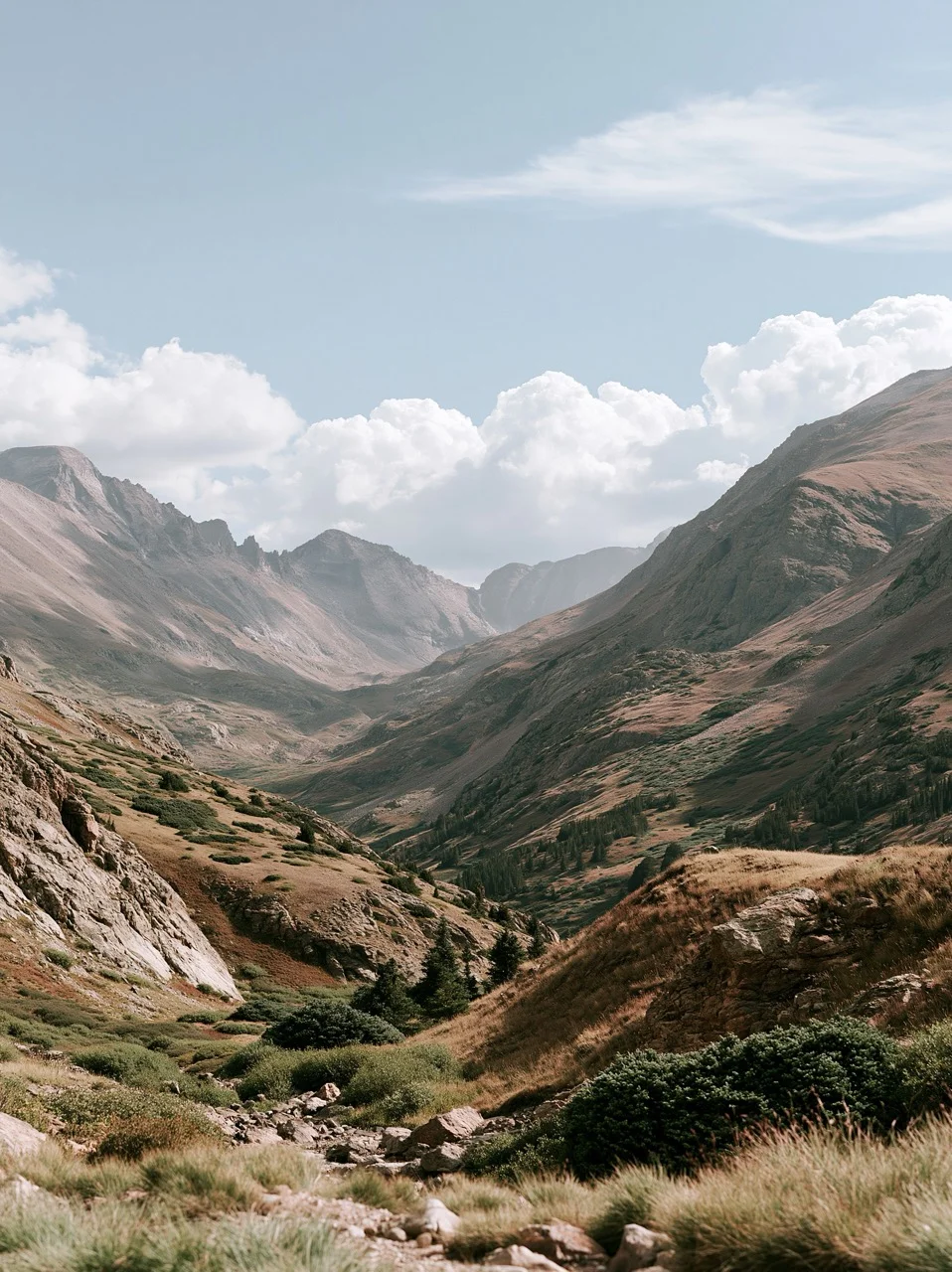
Also known as low-saturation, desaturated colors, dusty tones, understated colors, soft palette, mountain landscape
0
0
0
AtomWords
Insights
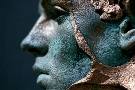
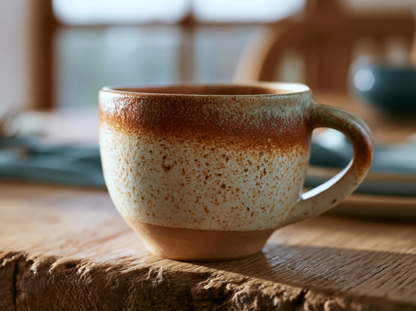
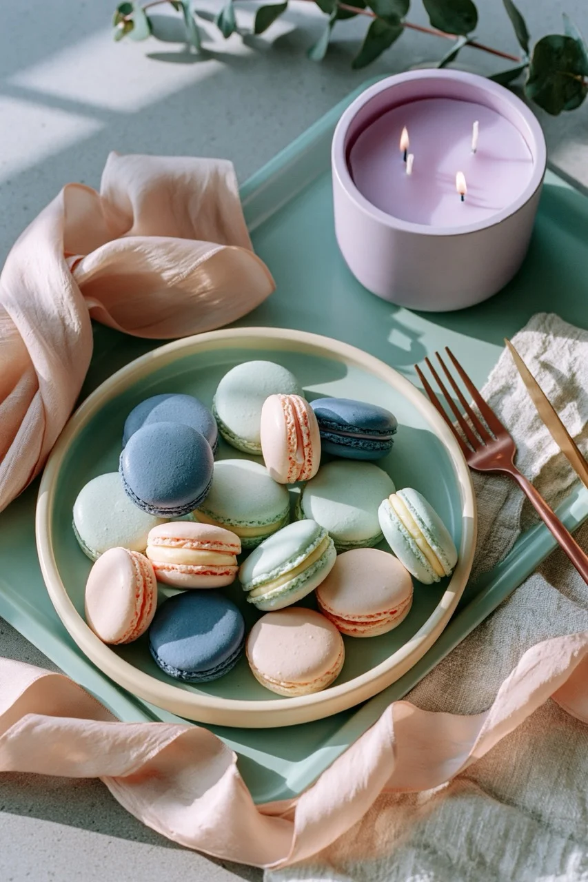
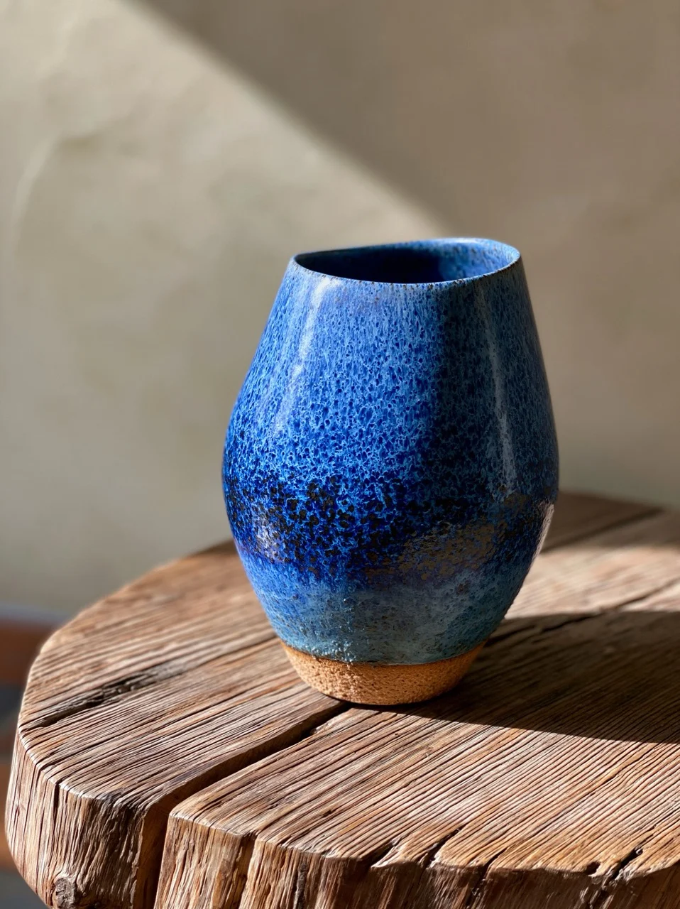
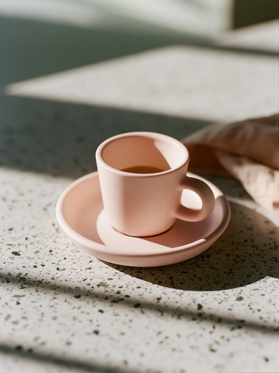
A low-saturation color harmony that softens contrast, creating a sophisticated, peaceful, and understated atmospheric look.
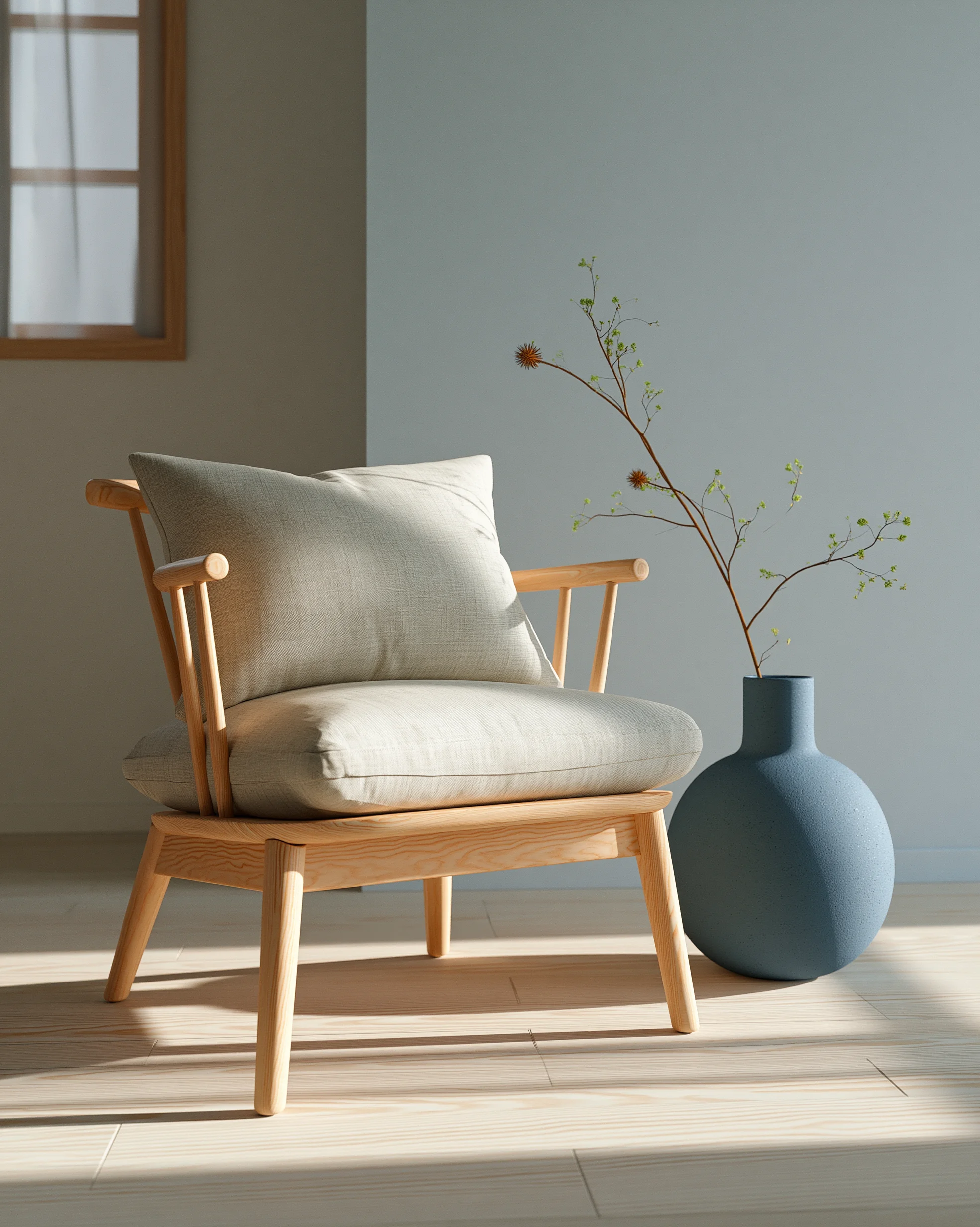
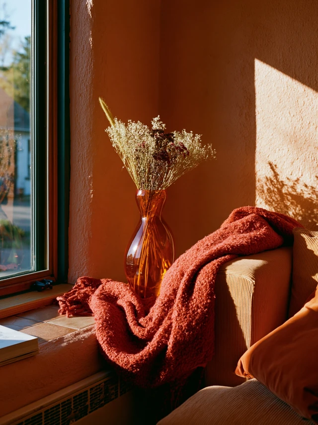
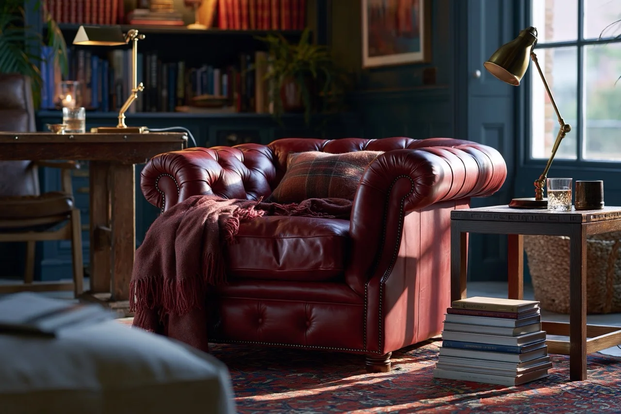
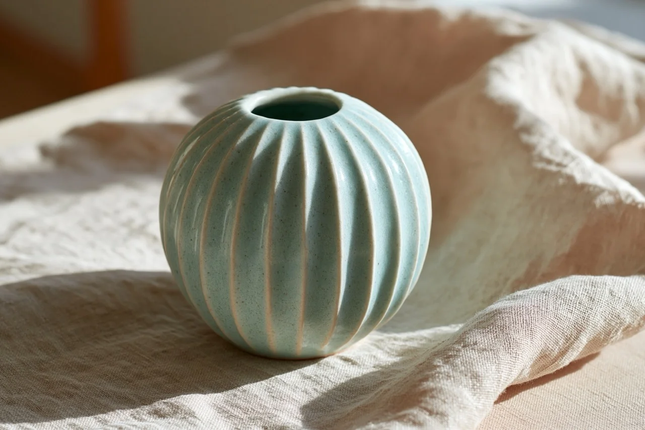
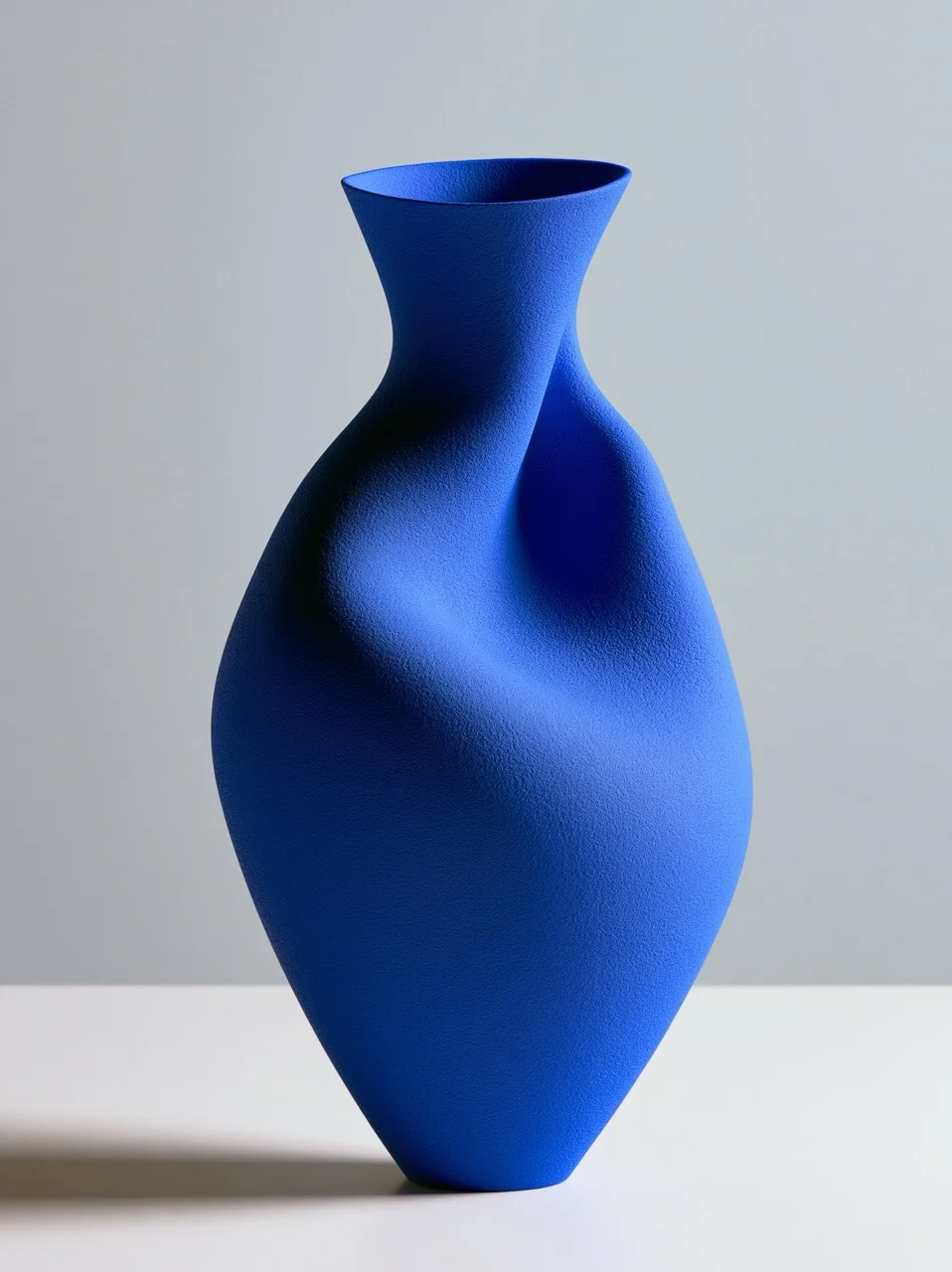
A muted color palette dials down saturation to create a calm, sophisticated, and timeless atmosphere. Rather than shouting for attention, it relies on desaturated, dusty tones like sage, slate, and mauve to build depth and quiet elegance.
When to Use It
Perfect for editorial fashion, Scandinavian interiors, and cinematic landscapes where you want to evoke nostalgia, serenity, or high-end minimalism. It pairs beautifully with soft, diffused lighting.
Insider Tip
Avoid using this with harsh direct sunlight, which artificially boosts saturation and ruins the delicate, low-contrast balance of the palette.
June 22, 2026