1/4
9
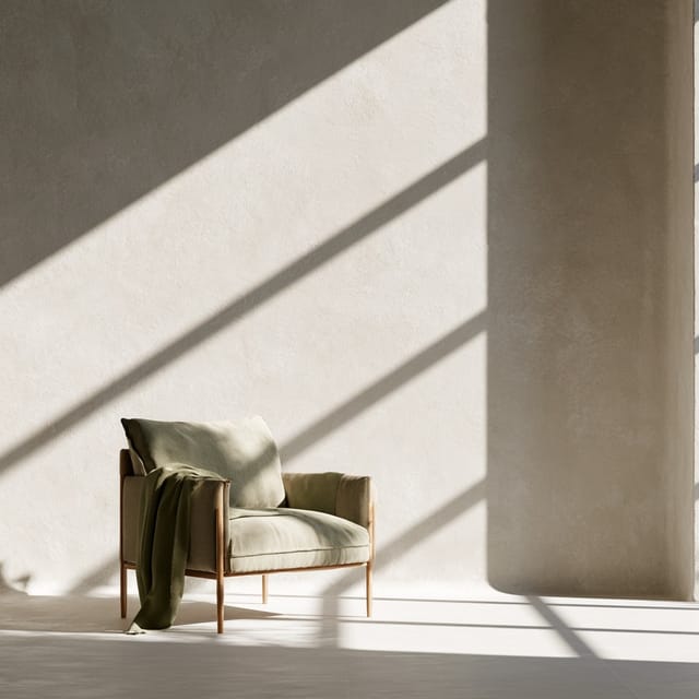
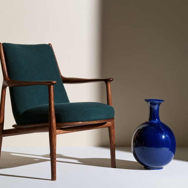
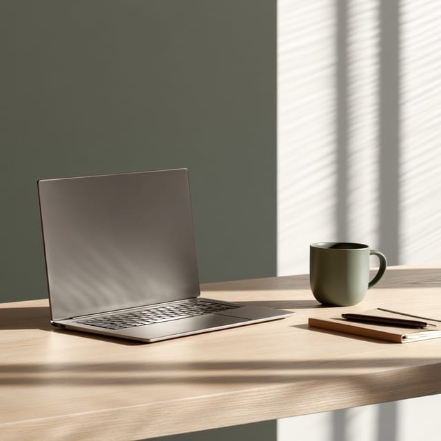
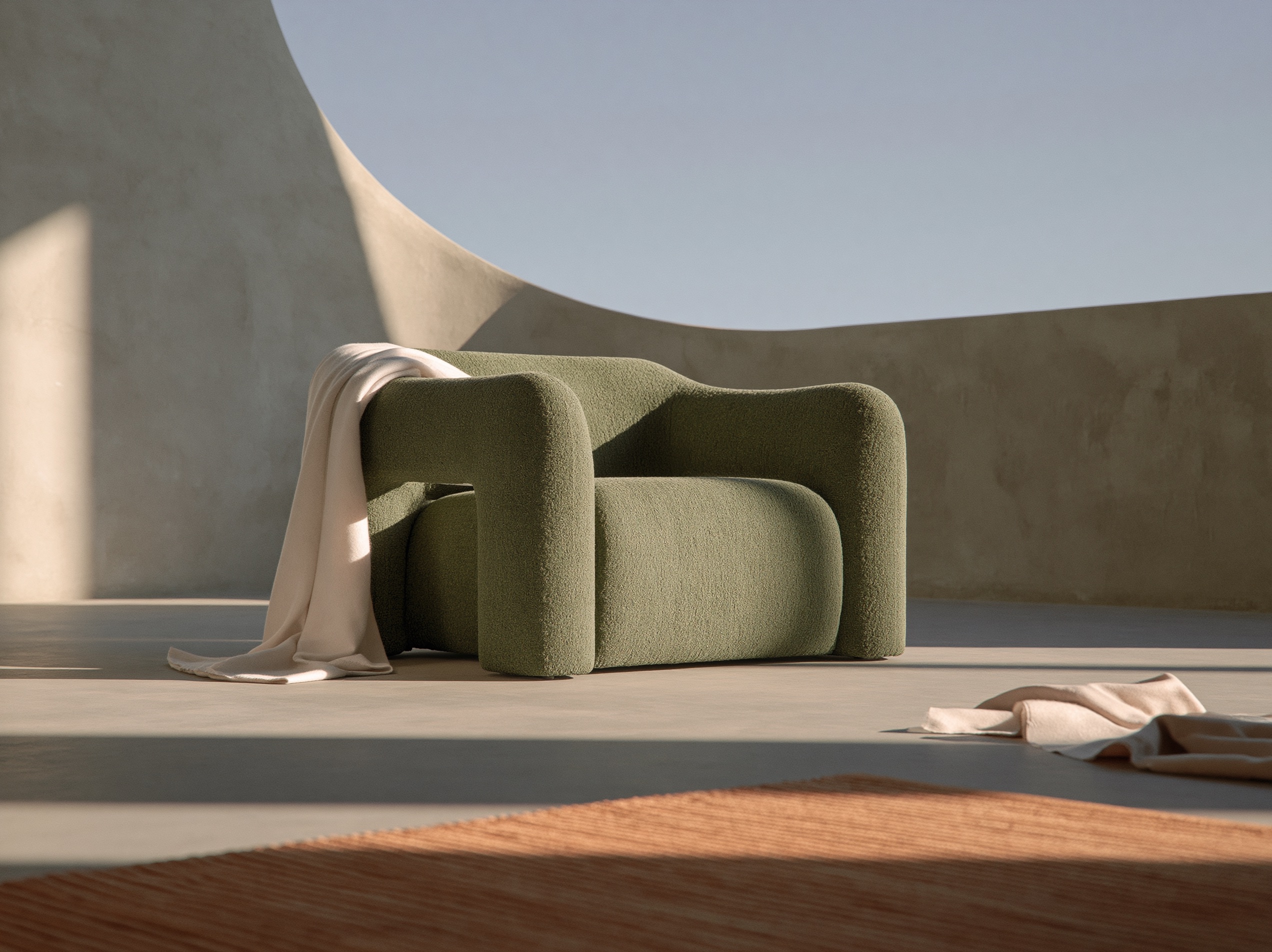
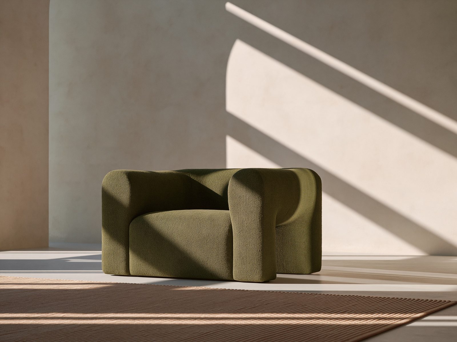
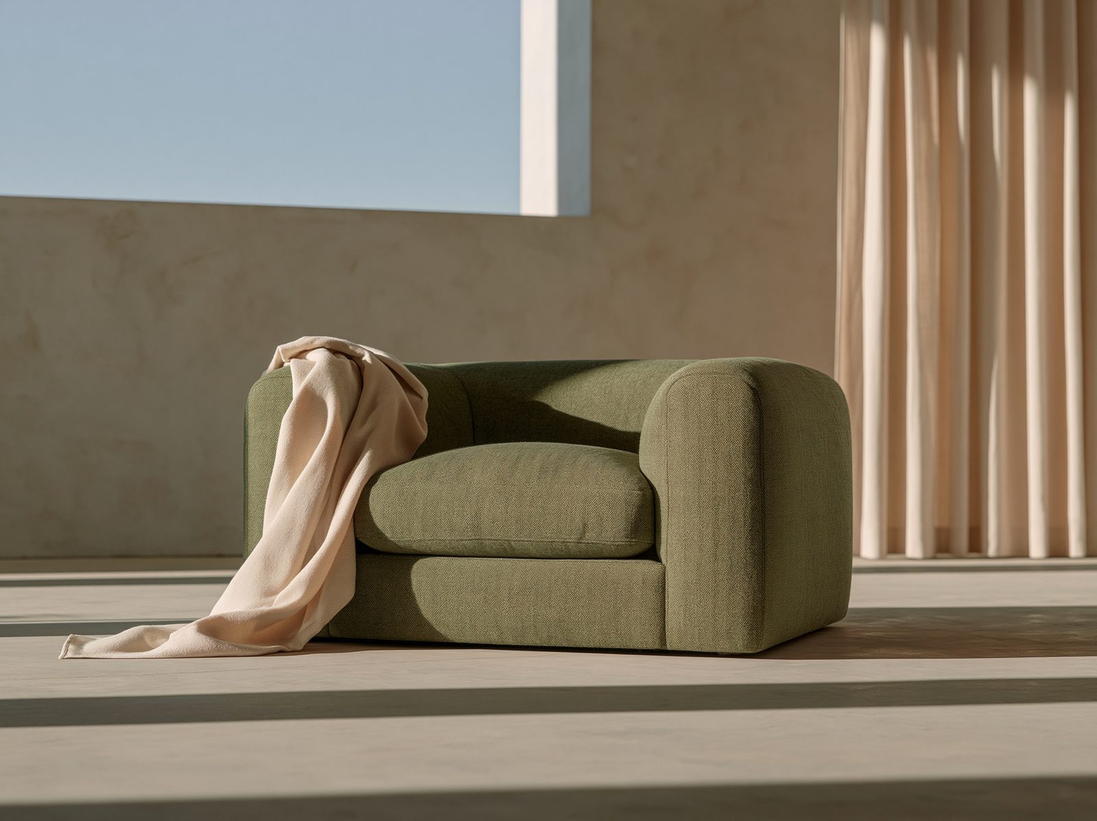
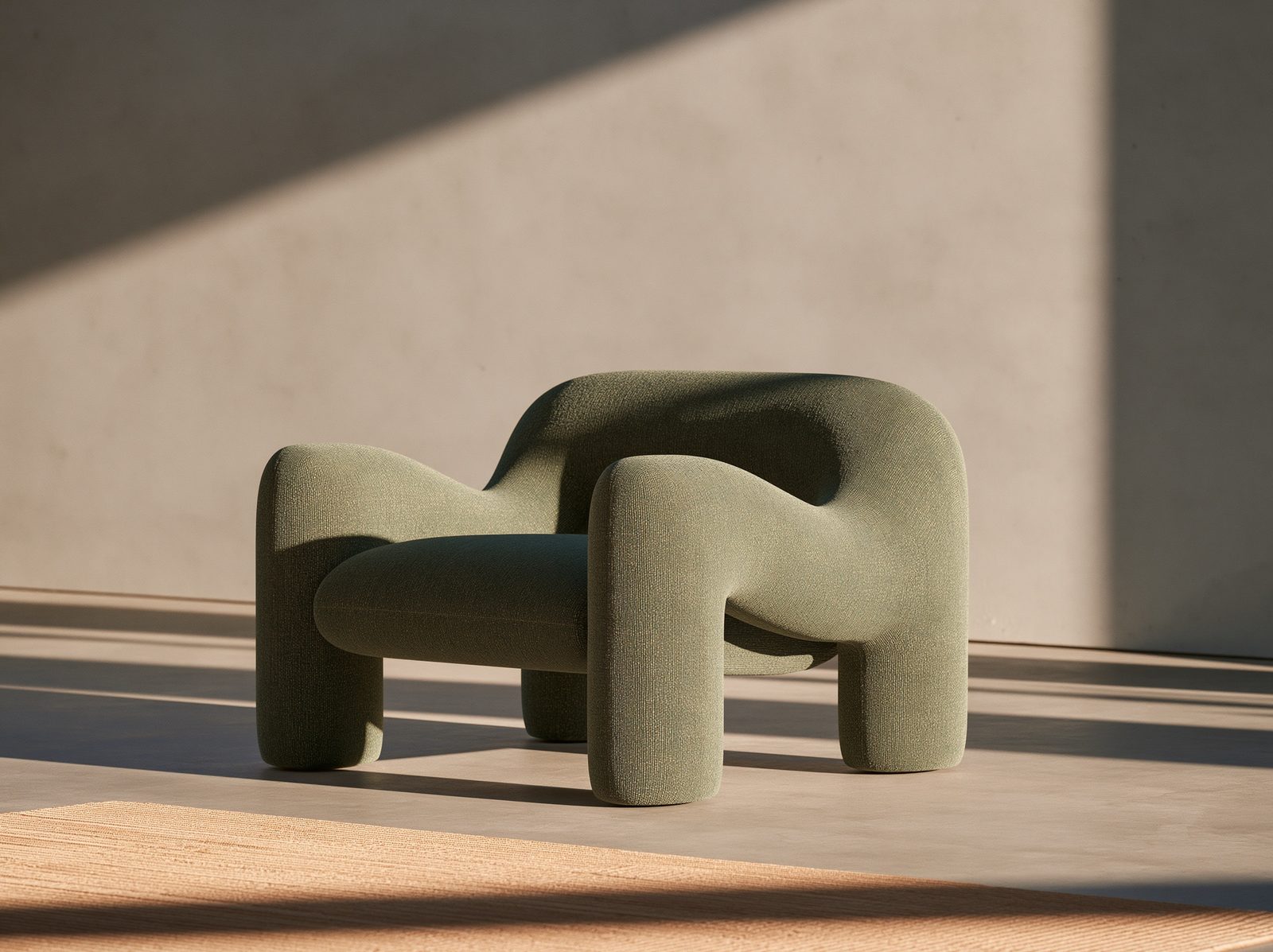
Desaturated spruce green is a muted, cool-toned deep green with heavy gray undertones, mimicking the quiet, shadowed foliage of a pine forest on an overcast day.
Sophisticated Minimalism
This color brings a quiet, intellectual maturity to your scenes. Because it sits between deep pine and slate gray, it evokes nature without the loud energy of a bright green.
Styling tips
Contrast with warm neutrals: Pair it with raw oak or brushed brass to prevent the cool, desaturated tone from feeling sterile.
Avoid flat lighting: Under weak, even light, this hue can turn muddy. Use soft directional light (light coming from one side) to bring out its velvety depth.
Full prompt
A sleek minimalist armchair in desaturated spruce green fabric, positioned in a quiet concrete room under soft overcast window light. --ar 4:3 --preview
Model: Midjourney · v8.2
Made with Desaturated spruce green
Nothing yet — be the first.