AtomWords Insights:
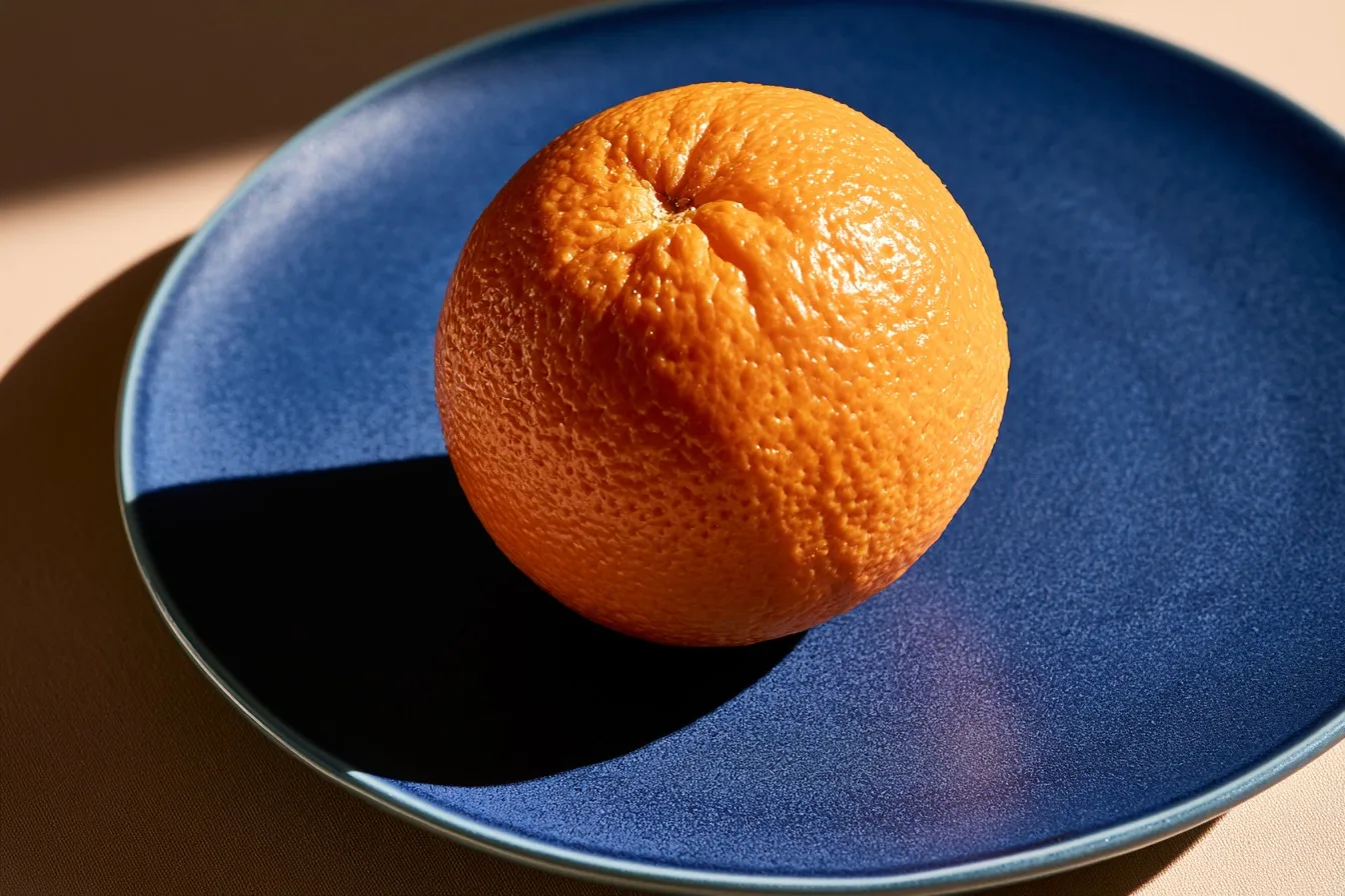
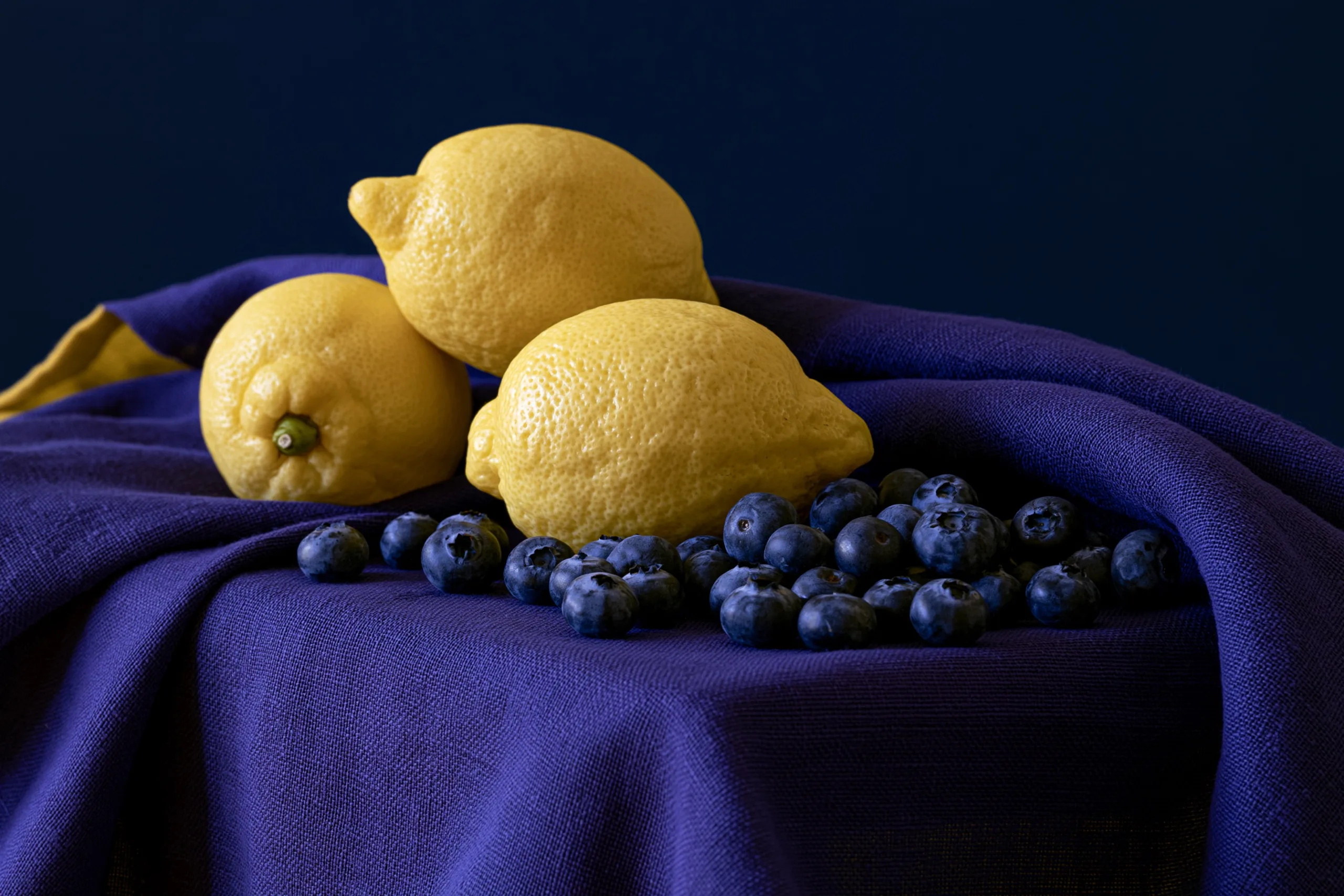
Split-complementary uses one base hue plus the two colors adjacent to its opposite, creating vivid contrast that’s softer and more nuanced than a straight complementary pair.
Reach for split-complementary when you want strong color vibration but a complementary palette feels too aggressive—it gives you one dominant hue and two cooler accents that frame it without clashing head-on.
The beginner’s pitfall is letting the two split hues fight for attention: keep the base hue occupying 60-70% of the frame, and use the two near-complements sparingly, like a garnish, not a main ingredient.
Full Prompts:
split-complementary palette in a still life of three lemons and a scatter of blueberries on a deep violet linen cloth, yellow anchoring the frame, blue-violet and red-violet accents only, no other hues, flat even light, shot against dark --ar 3:2 --style raw --s 50 --no green, orange --preview