AtomWordsThe Visual Dictionary of AI Art Keywords
AtomWords Insights:
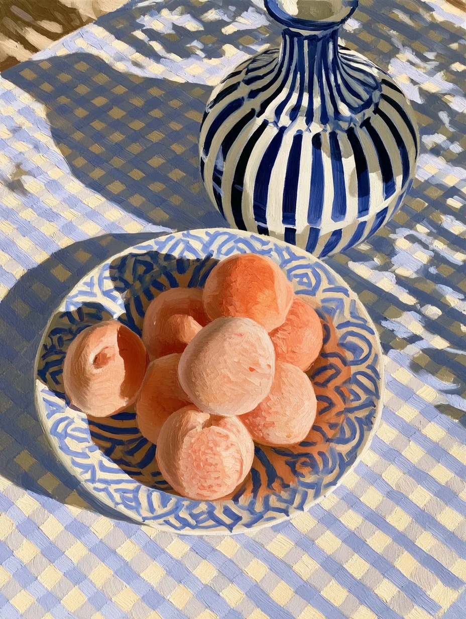
A base hue paired with the two hues adjacent to its complement provides sharp contrast with softer, more nuanced edges.
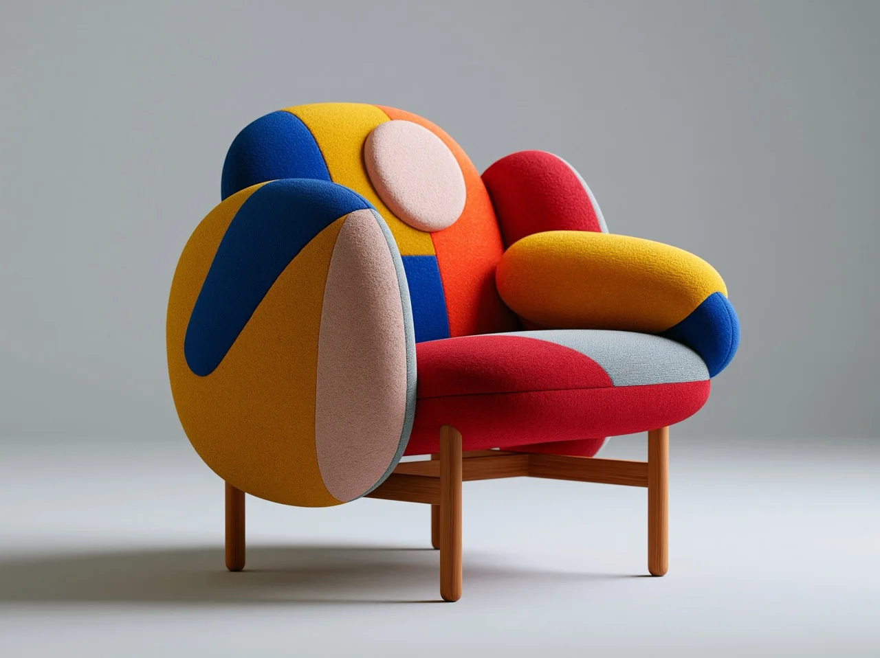
🧠 Split-Complementary Nuance
This scheme takes a single base color and combines it with the two colors that flank its direct complement. The result is high contrast but less jarring than a straight complementary pairing, offering more nuance and complexity to a composition.
Where to apply Interior design accents that need to pop without clashing, product packaging for sophisticated contrast, graphic design layouts where text and background need clarity without aggression, and film color grading for period settings.
Full Prompts:
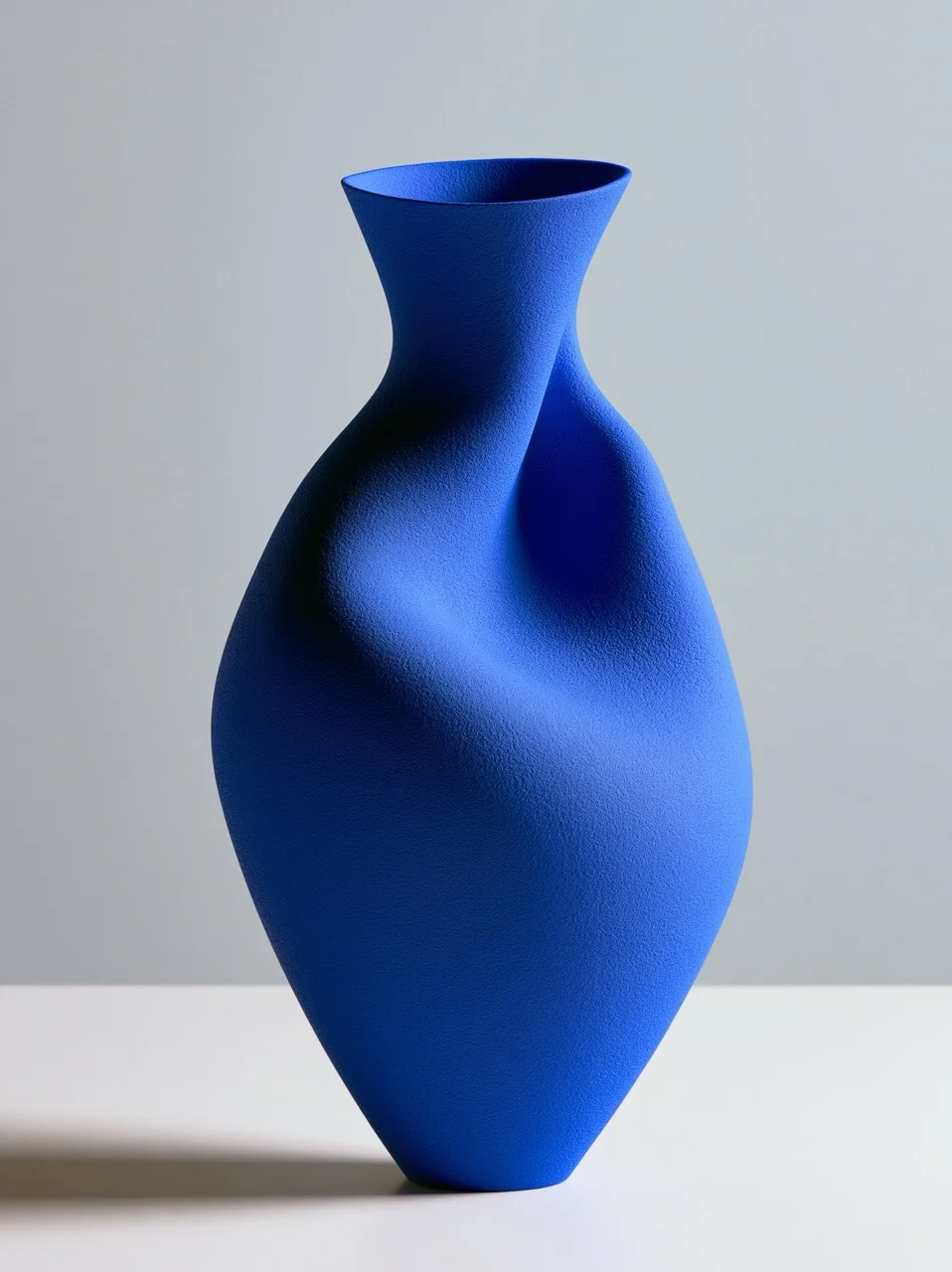
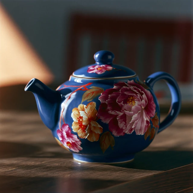
split-complementary color scheme, a product shot of a royal blue ceramic teapot adorned with hand-painted magenta and yellow-orange flowers, placed on a dark wooden table with a single warm spotlight from the left, casting soft shadows. Macro lens 100mm, revealing glaze texture, desaturated background, Kodak Ektar 100 color pop. --ar 1:1 --style raw
Discover More