AtomWords Insights:
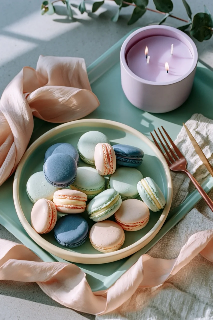
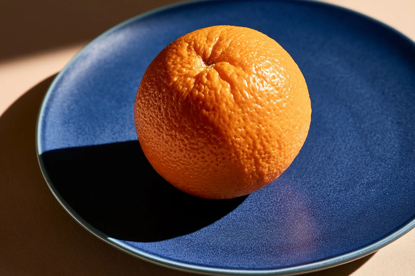
A complementary color scheme uses two hues from opposite sides of the color wheel to create maximum contrast, making both colors appear more vibrant.
Achieving Pure Contrast
To master a complementary color scheme, assign an unequal 70/30 distribution. Let one dominant hue own the background and shadows while its polar opposite claims the focal subject. Avoid equal 50/50 splits, which create an unpleasant visual vibration that strains the eyes. Always use strict negative prompting to block transitional neighbor hues that dilute the stark, satisfying tension between your chosen pair.
Full Prompts:
a close-up photograph of a single ripe orange on a matte cobalt blue ceramic plate, utilizing a bold complementary color scheme, stark visual contrast between the textured warm citrus and the smooth cool ceramic, dramatic side-lighting, minimalist kitchen styling --ar 3:2 --style raw --s 100 --no red, yellow, green, purple, white --preview